Part 3: Assignment 3 (Concert Poster)
Final illustration:

Ideas Development
Getting started
I decided to base this assignment work around a friend's band, Ivy Fire. Rather than make something fictional for this assignment, I felt would be much better to use a real band who do real performances. I also think it is quite important that I can ask them questions, and then gauge their reaction to the final illustration at the end of the assignment.
They describe the style of their music as being "quite rocky with funk". The poster is for a performance at an Eastbourne town centre pub.
They describe the style of their music as being "quite rocky with funk". The poster is for a performance at an Eastbourne town centre pub.
Visual Research
I collected together a wide variety of different gig posters onto a Pinterest board. I was struck by the incredible diversity of the illustrations and artwork. I'd say that this particular field of illustration seems particularly alive, vibrant and exciting. A side thought occurs to me - why do most movie posters use photography to catch attention, whilst gig posters are more inclined to use illustrated/graphic artwork?:
I spent a very long time just looking at posters - enjoying myself basically! Lingering and analysing where one in particular caught my imagination. A few thoughts on some of the posters on my board:
 With this Calibou poster, I loved the repetition of the figure that creates an overall pattern. It made me think of wallpaper design. I liked that each individual figure has a slightly different pose, and this introduces visual interest into something that could have been merely repetitive. However, a question is where is the visual focus? Perhaps the eye falls on the band name because of its greater size?
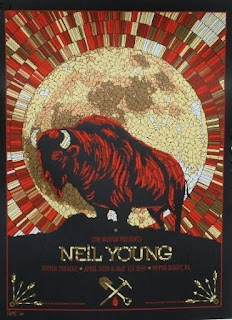 In this Neil Young poster I love the colour palette and the representation of "texture". Reflecting on the visual hierarchy, the bufallo sitting in the contrast of the light moon draws the eye. It is clearly the focus of the entire poster. The warm colours of the mosiac effect also seem quite prominent in the visual hierarchy. The performer and gig details aren't that eye-catching and seem very low down in the visual hierarchy. In fact, I'd say this is true of many of the gig posters I've seen; in that a striking artwork takes prominence over the "product" (i.e. the gig details). This seems to be a flip of what I'd generally expect in most graphic advertising - where the product/brand detail is a lot more centre of attention? Take for instance the next one...
 ... this Florence and The Machine poster is stunning. I love the artwork. It is exciting, quirky, and a huge amount of movement and energy is captured in the big wave and illustrated sea monsters. However, as a poster to promote an individual concert, it is lacking. The textual details are far too small. Perhaps when it comes to famous bands, maybe these posters are serving an entirely different purpose? In an age of Spotify/online gig listings, social media, email mailing lists, perhaps the role of the gig poster is no longer to promote and advertise concerts. That information is readily available online. For the more famous bands and performers, who looks at a poster stuck up on a wall, and decides to get tickets?
Therefore, I'd argue that the gig poster (for more famous performers) becomes a way to create and enhance a unique visual identity for the band/their music? E.g....

... in this Bastille poster, the concert details are barely visible. But there is a very strong visual mood and identity which I'm now linking with Bastille.

However, in the image above, I've chosen unknown performer(s), and predictably the gig details are prominent. This is the kind of poster that you'd see pasted up in the club or pub to advertise and create ticket sales.
I spent a very long time just looking at posters - enjoying myself basically! Lingering and analysing where one in particular caught my imagination. A few thoughts on some of the posters on my board:


Therefore, I'd argue that the gig poster (for more famous performers) becomes a way to create and enhance a unique visual identity for the band/their music? E.g....

... in this Bastille poster, the concert details are barely visible. But there is a very strong visual mood and identity which I'm now linking with Bastille.

However, in the image above, I've chosen unknown performer(s), and predictably the gig details are prominent. This is the kind of poster that you'd see pasted up in the club or pub to advertise and create ticket sales.
Spider diagram to explore associations
I produced a quick spider diagram to explore a few thoughts and association - linking to the band name and the style of music they play.

I think it is quite useful to add some colour to spider diagrams. Maybe kick-start associations and visual ideas?

I think it is quite useful to add some colour to spider diagrams. Maybe kick-start associations and visual ideas?
Sketches and exploring with thumbnails
Next stage was to explore with thumbnails and experiment with a few ideas:

I felt that concept on the left was a little obvious. I think it was clear to me that I wanted to avoid obvious ivy shapes and form. I liked the fact that a rock band could be associated with foliage. The second image looked promising as a concept. The band name coming forward out of swirls of twisted foliage. I liked the balance - and possibilities - in that thumbnail so I decided to develop that idea.
Drawing
Taking the idea from the initial concept, I produced the drawing below using liquid ink and black fine liner:

Producing the final image / digital manipulation
Developing the floral/ivy decoration...I thought that the drawing (with a bit of minor colour adjustment) would work out as the background for this illustration. Once I started putting things together, the sketch was just far too busy and the colours just a little too 'folksy' and whimsical. The drawing was not suitable; definitely not the artwork matching a rock band, and would certainly not please the band members.
Therefore I had to go with more radical change of direction. I decided to take out the colours and reducing to a line drawing (using mainly the Colour Gradient Map tool of Photoshop). The ivy in green line was too visually obvious, but the ivy in red line effect was visually appealing to me. The fact that the foliage/ivy is in a swirly red line seems to make a visual reference to the ivy "fire".

Thinking about the style of the band name...
I think that the band name showing quite prominently is generally quite important for a gig poster (especially important for an unknown band as well). Perhaps for an established band/brand, a little more creative license can be applied on the poster, and perhaps the band name doesn't need to be quite so prominent? But here - I wanted the eye to go straight to the band name.
I went with quite a blocky Sans Serif typeface to give a fresh and modern feel. Although they are a rock band, I wanted to avoid any typography stereotype of a "rocky" style of font. Imitating any obvious "rock" style (like Metallica's or Iron Maiden's) would have been an error of judgement.
Also I felt it was a useful addition adding a slight flickering green glow - a visual link to the fire of the band name. The sharp glow in the final artwork works well for me. I like it. The high contrast of the text against that background also draws the eye.

Positioning the gig details...
The obvious position for the gig detail was centred under the band name. It works well there, and the central alignment helps achieve a calm mood to the composition. The text needed to be smaller - important that it was reduced in the visual hierarchy of the image and didn't clash for attention with the prominent band name.
I kept the text white (after some experimentation with green text and some glows). Simple looked best.
Initially I had the type arranged in neat rows all with an even size. However, this seemed a little visually static and flat. "Jiggling it a bit" was a subtle - but notable - improvement. Resizing some of the text and making sure that they weren't all sat on a flat horizontal seemed to add a lot more energy and dynamism to the entire block. Perhaps because the decorative ivy is also a bit messy, slightly messy alignment of text also suits.
The Composition...
The composition literally puts the band at centre stage with full centre focus. With the big circle in the middle, perhaps I had a subconscious recall of vinyl discs with the central area showing text detail and the line grooves all the way around? Perhaps my entire artwork is a vague mimic of a vinyl record?
Also, I can see that this Caribou poster also indirectly influenced my work. The repetition of the spaceman, perhaps was a visual inspiration for the repetition of my foliage?

Critique of the final artwork...
I want to take opportunity to step back and provide some thoughts on possible weaknesses and areas for development:
- Perhaps one criticism of the image is that it is rather limited in its palette. Perhaps a dash of colour in some of the floral motif could have added further visual interest and broken the monotony of the floral decoration.
- And perhaps the floral decoration in itself is a rather monotonous style and perhaps some variation in the foliage (sizing and style of leaves) could have created greater interest.
The Band's Reaction
This was the part of the assignment that filled me with most trepidation. It is one thing to please yourself and be happy, quite another thing entirely, the reaction of the people you are making for. I suppose as a professional Illustrator this last, client reaction phase of the process may always induce nerves? However, I was very happy with what I was told:"Awesome". "Amazing".
In other words, it went down very well! I'm extremely glad of the reaction because it signifies that I got the general direction of the concept/artwork correct.
Final thoughts on the assignment
This assignment has been a good learning experience. It has given me opportunity to think about my workflow/process of developing an image. I think that this assignment has made me realise that I'm getting increasingly drawn towards a style of image development which is:
1. Produce in a traditional media
2. Then manipulate it and experiment digitally.
I need to experiment some more, and "find my feet" with this approach. Perhaps I will develop further thinking and approaches through part 4.
As the introduction to part 4 states, a main distinction between illustration and fine art is an awareness that the artwork is for a specific purpose and the artist should have the target audience in mind for the end product. Throughout the process of producing this image, the target audience was never far from my mind. I was constantly checking my ideas/visuals against questions such as, "does this reflect the persona and style of the band?" or "what will the person walking past the poster think?".
As the introduction to part 4 states, a main distinction between illustration and fine art is an awareness that the artwork is for a specific purpose and the artist should have the target audience in mind for the end product. Throughout the process of producing this image, the target audience was never far from my mind. I was constantly checking my ideas/visuals against questions such as, "does this reflect the persona and style of the band?" or "what will the person walking past the poster think?".


Comments
Post a Comment