Part 3: Client Visuals
Exercise details
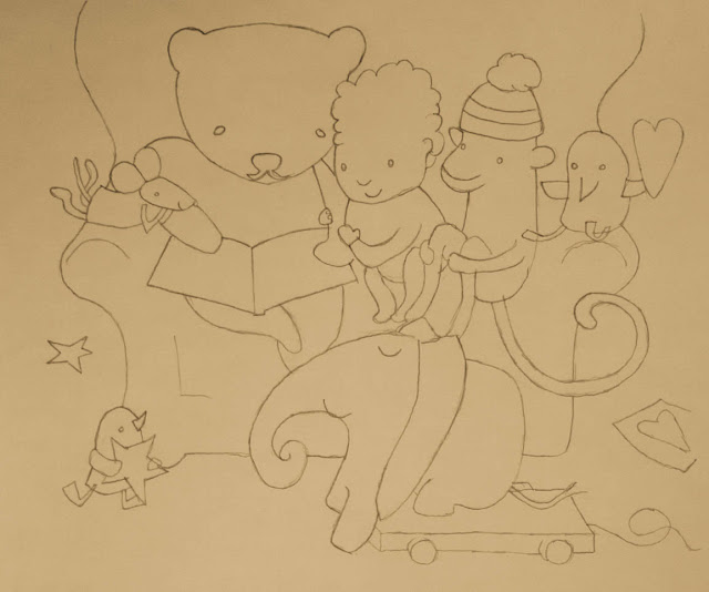
In this exercise I will be taking two finished illustrations and creating the line visual for each one.Visual for Illustration 1
I've chosen a children's book called, Recipe for Bedtime, illustrated by Sarah Massini. I chose the artwork on the cover of the book because I felt it was charming and had a sufficient range of content for me to work with.

Initial line visual:

I found this exercise to be rather curious. It felt like a no creativity exercise; merely basic observation and drawing skills. The line drawing was quite straightforward to produce, and reducing down the visual detail into a simple drawing was fairly straightforward. I think I've been very tight and controlled in this drawing, there is no looseness and expressiveness to the line. I was constantly mindful of having to create an accurate and sharp line drawing of the original image. I feel that the drawing is fairly successful it is faithfulness to the original image but, as a drawing itself, it is quite lifeless and lacking in energy.
I can't say I was particularly excited by this exercise, but I see the point about distilling things down to a simple drawing which can give others an idea of the illustration concept. The elements of the image were fairly straightforward to identify and I felt I drew them in sufficient detail for elements in the picture to be understandable. I had to have restraint during this exercise; my natural temptation was to add in more tone and texture.
Next stage - reducing the detail...
I found this next part of the exercise very tedious and dull. Even though I know it is important to keep practising distilling down, simplifying and reducing detail whilst retaining meaning. Compared to the first drawing:
I found this next part of the exercise very tedious and dull. Even though I know it is important to keep practising distilling down, simplifying and reducing detail whilst retaining meaning. Compared to the first drawing:
- I took out some of the lines that indicated texture
- Removed those lines not contributing to the meaning/form of the character or object

And also, as a sequence:

I can see how this kind of simple line visual would be perfectly valid for communicating the style and meaning of the proposed illustration to a potential client. Nothing essential has been lost. Mainly the removal of tone/texture.

I can see how this kind of simple line visual would be perfectly valid for communicating the style and meaning of the proposed illustration to a potential client. Nothing essential has been lost. Mainly the removal of tone/texture.
Visual for illustration 2
After the first experience, I was keen to do something different, and perhaps simpler. I came across the illustration created by Edel Rodriguez for the cover of Newsweek (2nd June 2016):

My interest in this illustration was piqued because this artwork had allegedly sparked up some controversy. Some critics considered the cover to be sexist; depicting old-fashioned stereotypical views of women, as well as being predatory in nature. Claims refuted by the artist. In a Huffington Post interview, Edel Rodriguez stated the following comments:
"Most of my colleagues, both illustrators and art directors, love the image and think it’s an accurate representation of the story... They understand that our job is to provoke the viewer into reading a story...
I wanted to depict the harassment that women suffer. How the harassment can be unexpected and come out of nowhere... I wanted to have the viewer see that moment when they look on a newsstand, and to be shocked themselves...
I was given the entire article and read it before starting my sketches. I came up with the ideas and the art director, a woman, felt that this one fit best with the point of view of the story."
I think the artist's defence of his image is clear; he was taking a text and trying to create an image that represented and communicated its meaning in a visual way. If there is fault, I think it is the text. The text should be communicating that the article is about exposing sexism, so that the image is then given that context and frames the meaning.
Although the image is very simple I've decided to do a visual on this because it contrasts to my first- which was relatively busy. Also, in my first line visual I was extremely controlled and "tight" in my mark making. I feel my drawing style is more relaxed loose and expressive, so I wanted this next line visual to be quick and loose:

When I look at the original image (compared to mine), I realised that I'd distorted it into more natural body proportions. Eg. slightly shorter legs, plus a bigger torso and head. I didn't notice at first how the artist has rendered the body in unnatural proportions. Why did he feel the need to do that? Perhaps he considered an abnormal body shape, with longer legs, more aesthetically pleasing?
Maybe there is something to be said for the indirect sexism of the image due to its aesthetics rather than metaphorical content.
Awareness of Art Direction
I'm extremely glad that I purchased a copy of the book, Making Great Illustration. It provides excellent case studies on the process and workflow of many illustrators. Useful for this exercise, it gives some examples and commentary on the visual and art direction behind some pieces of published illustrated work.
It is fascinating to read about the creative process used by many professional illustrators. I am struck by the diverse nature of their approaches. I also realise that the term "client visual" is used in a diverse way. However, in my reading I kept coming across a tension between clients' signing-off ideas versus the creative process. For example in this extract quoted from the American illustrator, Brad Holland:
"Most clients require preliminary drawings before committing to an idea, but this can dull the creative process as well as forcing the image to be overly explicit to ensure the [art] editor can access it more immediately, thus potentially impeding the evolution that happens during the process of producing artwork."
This particular illustrator prefers complete authority to create images unimpeded. Below I include an initial visual and final artwork created for a Las Vegas seafood restaurant. I immediate saw the obvious reason for this part 3 exercise; understanding the role that visuals play with clients:

I find the visual vs final image interesting because I can see the artist's thinking process in the development of the final artwork. How the shape of the fish was refined and the composition strengthen by increasing its size and the size/positioning of the fins. It is also clear to see that the flat waters of the visual were not in keeping with the mood of the piece; choppy sea water so much more energy and interest.
Brazell, D., Davies, J. (2011) Making Great Illustration, London: A & C Black Publishers.
The Artist Behind the Sexist Cover, http://www.huffingtonpost.com/katharine-zaleski/the-artist-behind-the-sex_b_6585524.html?1422758276&, Online. 27th February 2017
It is fascinating to read about the creative process used by many professional illustrators. I am struck by the diverse nature of their approaches. I also realise that the term "client visual" is used in a diverse way. However, in my reading I kept coming across a tension between clients' signing-off ideas versus the creative process. For example in this extract quoted from the American illustrator, Brad Holland:
"Most clients require preliminary drawings before committing to an idea, but this can dull the creative process as well as forcing the image to be overly explicit to ensure the [art] editor can access it more immediately, thus potentially impeding the evolution that happens during the process of producing artwork."
This particular illustrator prefers complete authority to create images unimpeded. Below I include an initial visual and final artwork created for a Las Vegas seafood restaurant. I immediate saw the obvious reason for this part 3 exercise; understanding the role that visuals play with clients:

I find the visual vs final image interesting because I can see the artist's thinking process in the development of the final artwork. How the shape of the fish was refined and the composition strengthen by increasing its size and the size/positioning of the fins. It is also clear to see that the flat waters of the visual were not in keeping with the mood of the piece; choppy sea water so much more energy and interest.
References:
Bently, P., Massini, S. (2015) A Recipe for Bedtime, London: Hodder Children's Books.Brazell, D., Davies, J. (2011) Making Great Illustration, London: A & C Black Publishers.
The Artist Behind the Sexist Cover, http://www.huffingtonpost.com/katharine-zaleski/the-artist-behind-the-sex_b_6585524.html?1422758276&, Online. 27th February 2017


Comments
Post a Comment