Part 3: Making a mock-up
Exercise details
The purpose of this exercise is to produce a mock-up (alternative) book cover for an existing publication. I chose Iain Banks' The Crow Road as I read it fairly recently. The real cover is rather striking and I was intrigued by the notion of how I could do it differently.My final mock-up cover below:

Developing the mock-up
Visual Research
I started off by finding different covers for the same book. I felt it was important to see the range of ideas that had been chosen for real covers. These are the notable covers used for this title:
Cover 1 - I find the complexity of this cover pleasing. It is interesting how an illustration has been framed inside the shape of the crow. The cover is stark and rather unforgiving in style (much in tune with the content of the novel). However, my criticism is that it looks a little too much like a sci-fi, whereas the novel itself has a contemporary setting.
Cover 2 - Photography as opposed to Illustrated artwork? A very bland cover. Can see virtually no visual reference to the story.
Cover 3 - A little better than cover 2. Some layering in Photoshop has added some visual interest, but a rather dull cover overall. Also, can't particularly see the visual relevance to the story.
Producing the cover
From the outset I've had a very strong vision of what I wanted to achieve. The idea came to me perfectly formed as soon as I started reflecting on the book cover. I firmly intended to produce a linocut showing a single crow perched in the branches of a winter bare tree. Also, because linocut is still a relatively new for me to work - I saw this cover as an opportunity to have another go at it.
I felt that the aesthetic of linocut (high contrast black/white) would be the perfect media for this cover. Visually suitable to the dark and edgy subject matter of the novel.
I accept that the process of producing an illustration shouldn't be about jumping on the first idea. It is vital to explore and refine ideas. However, in this case I knew exactly what I wanted to do, and I was single minded about it. I don't necessarily see this as a bad thing; but I feel it will be - and should be - a rarity. I very rarely have a perfectly formed vision of what I want to create. This was an exception.
Below is the full, final linocut that I produced. I always had in mind a "split" composition, with the left side ending up as the cover in portrait aspect.

I'm pleased with the print shown above.
Also, there was a happy accident on the tree trunk. The paper has a slight tooth, and there wasn't quite enough ink, so it came out with a stipple effect that creates an effect like tree bark!
Notes on the digital phase
- The crop for the portrait book format was an obvious one; Left had side of the linocut would be the book cover, and I aimed to position the bird at the intersection of thirds.
- Positioning of the book title, perhaps a little quirky? I have spent a long time looking at it, and distanced myself many times, but I always come back to the conclusion that it seems to work up there in the top-left corner. I'm resting easy about it now.
- Creating stark high-contrast was a vitally important aspect of the style and mood I wanted to achieve. Therefore I manipulated the colour (in Photoshop) so that it was presented in pure and stark black and white.
- Pull quote: This was the real finisher. Adding the quote appeared to give the cover a final completeness as a mock-up.
Final reflections
I liked this exercise. And I feel my final cover is good. I'm pleased with how it is rather cold, brutal and a little menacing, which is in-tune with the content of the novel. Also, it has been good to experiment in a different media. I'm enjoying being creative with linocut, and I'm pleased with my outcome here despite my great inexperience with it.
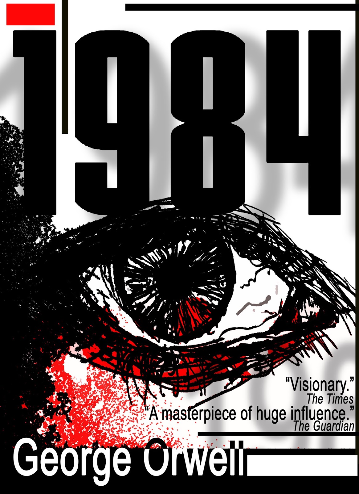
I decided to keep the classic "Big Brother's eye", perhaps a bit stereotypical, but I wanted it regardless because it is such an iconic association with George Orwell's novel. I roughly - and speedily - drew an eye in pen (I was not going for a realistic style of drawing).

After scanning in the eye, the mock-up composed in Photoshop. Here is the final cover artwork:

Reflections:
I wanted to achieve some kind of 1980s style and feel for the cover. In trying to do that I seemed to have picked up some Bauhaus influence along the way. On a subconscious level I realised I was probably bringing in influence from designer Peter Saville. Peter Saville's 1980s graphic artwork are recognisable from album and single releases from bands such as New Order:

However, overall I feel the cover is a victim of its own retro style. My outcome feels incredibly dated somehow and rather cheap; like a 99p thrift version of the novel to be sold in bargain outlets! When I try to unpick why I feel like this, a couple of thoughts come to mind:
- - -
Postscript
Since finishing the mock-up, I decided to produce another one. I was browsing my shelf and I picked up George Orwell's 1984; couldn't stop thinking about what I'd do differently for the cover... so I had a go:I decided to keep the classic "Big Brother's eye", perhaps a bit stereotypical, but I wanted it regardless because it is such an iconic association with George Orwell's novel. I roughly - and speedily - drew an eye in pen (I was not going for a realistic style of drawing).

After scanning in the eye, the mock-up composed in Photoshop. Here is the final cover artwork:
Reflections:
I wanted to achieve some kind of 1980s style and feel for the cover. In trying to do that I seemed to have picked up some Bauhaus influence along the way. On a subconscious level I realised I was probably bringing in influence from designer Peter Saville. Peter Saville's 1980s graphic artwork are recognisable from album and single releases from bands such as New Order:

However, overall I feel the cover is a victim of its own retro style. My outcome feels incredibly dated somehow and rather cheap; like a 99p thrift version of the novel to be sold in bargain outlets! When I try to unpick why I feel like this, a couple of thoughts come to mind:
- The typography of George Orwell + pull quotes is inelegant . Why did I choose a default - and commonly seen - font like Arial?
- A limited colour palette - cheaper bulk print runs in commercial printing?
Comments
Post a Comment