Part 2: Visual Metaphor
Exercise details
From the choice of different phrases available for this metaphor exercise I chose, "Broken Relationship." I chose this because I thought it seemed quite a difficult one to do, and I wanted to challenge myself.Looking at Visual Metaphor Artwork
There are a huge number of examples of Visual Metaphor which can be found online. I've collected quite a few that caught my interest and pulled them together below (with general thoughts added as annotation under each):
Also the composition of this image interests me, why such a tight crop?
Is the visual metaphor very clear though? What exactly is this image trying to say?
As above, interesting visual, but the exact meaning is a little elusive.
I like the clever use of photo manipulation. I also think the glow is extremely effective in making the impact of the final image.
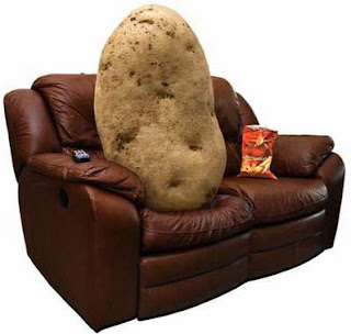
Straight to the point! (But what if you are from a culture that has never heard of the term "couch potato"?). Visual metaphors are always embedded into cultural references/contexts.
This is clearly a visual metaphor for economic choices, but I'm thinking is this visual a little too obvious and a little bit cliched?
Striking. Although the text has to be read for context to the image.
I think humour (or irony) in visual metaphors can be very effective. Could it be argued that in the visual arts, humour has a natural home in visual metaphors? Humour and visual metaphors seem to happily co-exist.
It takes a moment to work it out and to understand the meaning. I suppose some visual metaphors can be understood instantly, and some take a little (or more) time to take in and understand.
Power to the people! Digitally. A pondering thought... is it a picture of defiance, rebellion or frustration?
"Run away" brain.
I know quite a few people like this! Haha!
Met on Facebook? Obsessing with each other on Facebook?
Visual metaphors can certainly combine very different areas: Retro pop culture meets social controversy!
Overall, I particularly like the Banksy ones. I think his visual metaphors are very clever. They seem to have a meaning that we can clearly understand and relate to, yet paradoxically, there is great ambiguity and room for interpretation, making for a less than clear-cut interpretation. His images always seem to combine a sense of fun with a teasing "challenge" to the viewer with his political and social issues.
I've also found that some of the visual metaphors used in advertising can also be extremely powerful. Especially where a well chosen piece of information adds necessary meaning and impact to the metaphor. For example, in the Save the Children advertisement below.
Brainstorming and Ideas development
I thought I'd start the brainstorming/ideas development by creating some hand-drawn lettering (inspired by something I saw in the Hand Job book).Then I just progressed in my brainstorming in a fairly experimental fashion: Writing down words, drawing little sketches, doodling... I suppose you could describe it as some form of free-thinking visual process. It approach was quite enjoyable and allowed me to free-associate; letting images and things drift through my mind as I worked.
Here is my sketchbook page:
Development of ideas
The brainstorming process was directly leading me towards a drawing of two people in profile staring at each other with angry/disappointed faces, a broken heart between them.I was thinking back to one of the drawings on the Drawing and Painting exercise, and mulling over the possibilities of drawing this on crumpled newspaper. My thought was that crumpled paper could be a good look - visually enhancing and alluding to the "broken" theme. So I crumpled a piece of drawing paper, and drew in the main figures. I wanted the faces to be abstracted and subjective, and not accurately rendered faces. I didn't think the illustration would work with accurate drawings of faces.
My drawing on the crumpled paper:
...after this I felt it would be best to proceed mainly in digital. Experiment with traditional media combined with digital drawing tools.
Final artwork
Further explanations/reflections
- The original sketch of the love heart I felt was pretty good. I liked the style of it, so I scanned it, and manipulated the colours to enhance the red. This seemed to bring out the pencil strokes and marks; making it looked like the (metaphorical) damaged heart of a broken relationship. It was important that each piece seemed to visually be owned by each person, and therefore representing what they had between them is broken.
- The paper needed to be colder in order to visually represent the cooling and distance between people in a broken relationship. I manipulated the paper to a blue tint.
- I also enhanced the contrast of the shadows/crumpling of the paper to create more visual "tension" in the image. Softening with blur also helped it blend better with the other visual elements.
Overall, I'm not quite sure what I feel about this image! I'd say I've been successful with the visual metaphor, but the style of the drawing is completely different and new to me. And when I relax about it, I can say it is an image I like to look at. But I've never drawn faces like this and I'm very uncertain about such "cartoon-like" abstracted faces.


Comments
Post a Comment