Part 1: Assignment 1 (Say Hello)
Final artwork

Summary
I set out to create an image that could visually represent aspects of myself. I was intrigued by the possibilities of visual storytelling and the use of typography in the artwork. And in my final image, I incorporated text to convey direct messages about identity and one's sense of self. Further, I conceived of this image as primarily showing a 'striking' self-portrait. Again, my intention has been realised in the final illustration.
Producing this artwork has been an very satisfying and enjoyable process. In contrast to my assignment/exercise experiences during the Drawing 1 module, doing this first assignment on Illustration 1 has had a very different creative flavour. Certainly it has exercised my visual problem-solving and allowed me to be a lot more open in my creativity. What I've particularly enjoyed is the creative possibilities in combining drawing with digital work.
In the sections below, I explore in further detail my process and thoughts in producing this assignment work:
Evaluation
Initial thoughts and research
The assignment details a lot of possible information that could end up in this artwork.
- About myself
- Interests and inspirations
- Materials I feel happy working with
- What I would like to get from the course
I thought that trying to fit in all of the above would be very difficult, and some discrimination was going to be needed in order to make the piece work. Therefore I decided to concentrate on communicating information on me (the "about myself" bullet point if you like). At this point I was intrigued by the creative possibilities in how a sense of self / information about oneself can be communicated in a visual media through illustration.
In Moshekwa Langa's Untitled Index Drawing VII (below) I was struck by its striking collection of words and sentences:

I think it is interesting to be presented with things to read as part of the artwork. And it caught my imagination in that I could use the idea for textually presenting information about myself for this assignment piece. However, my concern with Langa's drawing is that it looks rather "doodle like" in appearance, and for the purposes of this first assignment I wanted something with a little more aesthetic finesse.
My attention was also drawn Luba Lukova's artwork from the Social Justice 2008 portfolio (below). I saw this assignment as featuring a self-portrait I draw or paint. The portrait in Lukova's illustration is quite striking and I immediately had a vision of a slightly abstracted self-portrait featuring prominently. I thought to produce a self-portrait influenced by Lukova's work:

At that point I knew for certain I wanted to play with typography combined with a self-portrait, combining the visual influences from Lukova and Langa's artworks.


Choice of self-portrait
I tried out a few initial ideas; the inspiration and style of Lukova's portrait (above) in mind. First I tried out extremely simple shapes (vectorised from a sketch):
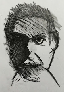
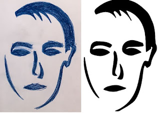 I didn't feel the image had the "weight" and the visual style that I had in mind. Too light. Too whimsical. So I then thought about trying out a slightly more detailed sketch with some colour manipulation. The quick sketch that I produced is below:


I'm happy with my final choice of an asymmetrical arrangement of text. Initial experiments with text in symmetrical balance (evenly spread down the page) gave it too much balance and it was duller in image as a result. I feel that asymmetrical makes the image a little more uncomfortable and also serves to focus attention on the single eye.
The cliche states that an eye is a window to the self, and perhaps that's why I'm happy for the eye to have some focus in the image. Eyes are important in communicating oneself to others (and therefore I'm deliberately linking back to the very purpose of this assignment).
I considered the use of colour. Re-colouring the type and/or the portrait would be entirely possible, but I dismissed the possibility. Initially I'd conceived the portrait as having colour - like Lukova's work - but I felt that colour would unbalance the image and the composition and give too much emphasis to the portrait. I quite like that the words and the portrait having a merge - a visual parity and equal importance to both. Just tonal a tonal gives it a little more visual impact. I'd argue that colour would reduce the appeal and impact of image.
Overall, I set out to achieve an assignment piece that avoided being whimsical in my portrayal of self. I feel I've achieved my intention. I can freely admit that my final image is rather brooding. But being frank and honest, that is entirely reflective of my current life circumstances and state of mind. I ponder: how would this artwork turn out at different stages of life/states of mind? Perhaps it should be an annual exercise with the final images collated after several decades. A visual record sense of self and mood through the years. How would those images change?
Image references on this page:
Thinking about style / reviewing other students' work
It was fascinating to review other students' blogs and their work for this assignment. It is always humbling to see other people's skills, creativity and hard work. Other students had produced some wonderful images that impressed me, but most of their images weren't 'in tune' to my own sense of self and identity. To state plainly - I wanted to produce a striking image that was "darker", more challenging, more troubled. Which - psychologically - is a very curious intention for me because I try to be quite light-hearted in life!Visually exploring and my prep sketches
Below is an image of my sketchbook pages showing some of the exploratory drawings and thoughts as I explored what I wanted to produce for this assignment:

Choice of words and the typography
An intellectually fascinating aspect of producing the assignment was the choice of words and the typography. The primary question, is what words to choose to represent a sense of one's own identity? In the end I chose a fairly straightforward collection of words. Nothing too challenging, or personal. The nature of the final piece could have been very different with a more intense set of words. I initially conceived of a bubble-like approach to the typography, and experimented with different ideas in my sketchbook. However, I disliked the look, and I didn't feel satisfied in how bubbles of words/type could visual merge and work with a stark portrait. Instead I created the type in Photoshop.Choice of self-portrait
I tried out a few initial ideas; the inspiration and style of Lukova's portrait (above) in mind. First I tried out extremely simple shapes (vectorised from a sketch):


Immediately dismissed; moving away into far too much detail and not the simplicity I had in mind. Also at this point, I felt that the use of colour wasn't the direction I wanted to go in either.
The sketch (below) was just very quickly and loosely produced - in order to see the possibilities of a pencil drawing:

I felt that this was a better direction, and this general style of drawing could work quite well in combination with my text. At this point, the sketch above was only meant to be a quick prep sketch - as it turned out I didn't need to produce another drawing. I felt quite happy with this one as I experimented with the composition. I like the looseness and quick energy of the mark making. I didn't particularly feel the need to develop the sketch from the idea above.
Decisions in composing the final artwork
The composing was done in Photoshop. Key question: how to arrange the words with self portrait? In the end, this matter was resolved fairly quickly. After quickly jiggling around a few arrangements, it worked best for the canvas to be filled with the portrait and the words down the right-hand side in an asymmetrical arrangement . This composition gave an unexpected focus to the eye (this was unexpected to me - I didn't intend the eye to have any particular focus). I thought it would make the image more interesting to add even more emphasis to the eye by enhancing it and improving the tone and detail of the initial rough pencil work. I gave the eye a little extra sheen and pupil emphasis by modification in Photoshop.
I'm happy with my final choice of an asymmetrical arrangement of text. Initial experiments with text in symmetrical balance (evenly spread down the page) gave it too much balance and it was duller in image as a result. I feel that asymmetrical makes the image a little more uncomfortable and also serves to focus attention on the single eye.
The cliche states that an eye is a window to the self, and perhaps that's why I'm happy for the eye to have some focus in the image. Eyes are important in communicating oneself to others (and therefore I'm deliberately linking back to the very purpose of this assignment).
I considered the use of colour. Re-colouring the type and/or the portrait would be entirely possible, but I dismissed the possibility. Initially I'd conceived the portrait as having colour - like Lukova's work - but I felt that colour would unbalance the image and the composition and give too much emphasis to the portrait. I quite like that the words and the portrait having a merge - a visual parity and equal importance to both. Just tonal a tonal gives it a little more visual impact. I'd argue that colour would reduce the appeal and impact of image.
Final reflections
Are there any ways that the final image could be improved / changed for the better? Certainly, any further work could focus on the typography. Arguably, the typography is rather haphazard in style, even though that was my intention, perhaps I missed a trick in applying more a typographic style more in tune with the word. I.e. Fool - could have a more "foolish" looking font. Also, in regards to the portrait, was I too quick in just using my initial prep sketch? It had its visual merit in having energy in the mark making, but I ponder how my final piece could be improved with a second - more developed - sketch.Overall, I set out to achieve an assignment piece that avoided being whimsical in my portrayal of self. I feel I've achieved my intention. I can freely admit that my final image is rather brooding. But being frank and honest, that is entirely reflective of my current life circumstances and state of mind. I ponder: how would this artwork turn out at different stages of life/states of mind? Perhaps it should be an annual exercise with the final images collated after several decades. A visual record sense of self and mood through the years. How would those images change?
Image references on this page:
Luba Lukova, Poster from "Social Justice 2008" poster portfolio.
https://s-media-cache-ak0.pinimg.com/originals/a6/49/cf/a649cff5a120e665d3ba6552ca0c110f.jpg,
11th November 2016
Moshekwa Langa, Untitled Index Drawing VII Taken from:
Stout, Katharine. Contemporary Drawing from the 1960s to Now. Tate Publishing, 2014.


Comments
Post a Comment