Part 2: Using Black and White
Exercise details
Of the words given in the exercise, the words sea and journey immediately stuck out as being in close combination. I therefore decided to theme this exercise on the two words combined.The notion of sea journeys immediately started me thinking of the viking period of history and the epic sea travels of these peoples in their exquisitely carved longships.
Ideas Development:
I started by creating a spider diagram to stimulate associations around the focus words:
Next I wanted to create a modestly small moodboard. I wanted to capture a few visual elements to use in my ideas development, and was fairly discriminating in my choices for the moodboard. I didn't want a moodboard that was overloaded. I had in mind a general visual style for the sea and ship I wanted to draw; my moodboard acted just as a refinement to my imagination:

After spider diagram and moodboarding, I then spent time sketching and exploring/developing ideas, Below is my sketchbook page (which broadly shows my thinking and refinement process):

Reflections:
The brainstorming mind-map was to explore the associations that I had with the three important words for the illustration, sea, journey and viking. From this brainstorming I started to visualise a viking longship piercing through the waves of a tumbling sea.
The general composition seemed to look right in the first thumbnails. A general "rule of thirds" layout with the ship positioned in the top left section. The asymmetrical balance visually works, with the boat needing the space on the "right" to sail into.
Then looking at some of the source material on my moodboard, I tried out some variations on the style of the waves and the boat. This development of ideas through sketches felt very important to me. I'm really starting to understand the importance of experimentation in the refining and developing of ideas. I think its best to have a spirit of playfulness - try things out. See what visually works, and what doesn't.
Final line drawing


I then took the image into Photoshop and then tidied up a few minor things, and the reversed. Wow! Was my initial reaction. The reversed image was significantly more pleasing and had much more emotional impact to me. The reversing had completely changed the character of the drawing, and this came as a huge surprise. I thought it may, "look a little better", but I wasn't expecting such a transformation. I also felt that the image would look a lot better with a thicker edged border, and more importantly, a white filled sail. Filling the sail with white made the image better. The boat seemed more 'robust' and physical because of the contrast the sail provides against the sky.
 I then printed out the image in both the original sketch (white-line drawing), and also the reversed black (white line) version. I then cut out parts off the white image and put the pieces on top of the black. I kept the white cutout pieces to just the clouds and the viking boat. It worked out - and looked fine to me. The white representing the clouds, and the viking boat stands out better in white. The cutout pieces give a slightly uneven look to the image, and a little bit of shadow too. This provides a very subtle three-dimensional look to the image.
 However, I found that cutting out bits of paper was extremely fiddly and a rather irksome process/technique. Perhaps I could have achieved the same kind of effect using digital tools?
In the photo below the cutout pieces are a little bit ragged and messy, and again I'm not particularly pleased with the messiness of cutout paper:
- - -
FINAL ARTWORK:

Extra sketching:
I also think that silhouettes of trees make for interesting high contrast (monochrome) images. I went for a walk out by a nearby field and the trees were sharply contrasted against the sky. I immediately thought of the opportunity of a monochrome sketch, and the thought, "I wonder what it would look like inverted.". Sketch below, and then the inverted image:

In the sketch above, I don't think the inversion is particularly effective. I think it looks too much like a cheap radiation / x-ray effect that we see on many graphic apps. I think the black-white inversion could suit more crisp line drawings (such as the Viking ship I produced).
Researching Illustrators' work:
This part of the exercise involves researching examples of illustrators work which I would consider to be "graphic" in style.
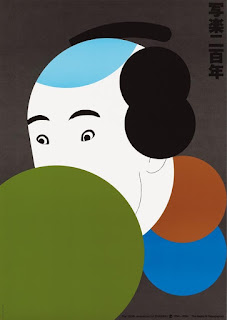
When researching I came across the work of Ikko Tanaka (born 1930-2002), a Japanese Graphic designer and Illustrator. Ikko Tanaka set up a design studio in Tokyo in 1963 and worked for a wide range of international corporate clients throughout his career.
Commenting in Fifty Year of Illustration, Zeegen and Roberts (2014) consider Ikko's "... reductive style seamlessly blends East and West and is most evident in his striking posters, perhaps the most famous of which is Nihon Buyo." Which was a poster commissioned for UCLA in 1981:

I'm fascinated by the image. Although it is extraordinarily reductive, one can still "see" all the elements of a Japanese Geisha portrait. The picture works by allowing us to interpret our notion of a a Geisha onto the simple blocks of colour/shape. However, I do believe care must be taken with this kind of simplistic approach to illustration; as it can only work if one is familiar with the image that it is representing. For instance, if one had never seen a Geisha, what would one's reaction and interpretation be to the image above? Surely totally different. Maybe it could be said that Illustration is about sharing visually; a visual conversation between the viewer and the creator. Unless there is common ground of understanding, then the illustration is likely be misunderstood.
- - -

In another of Tanaka's poster, shown above, we see his simple reductive "graphic" style being used to interesting effect. I like the way he has used big blocks of coloured paper, and then directly inked over and used type. There is something rather humble about his work. It is immediate, simple and direct.
Again, in a poster created for Amnesty International, Tanaka has been sublime in his reduction of complexity down into a collection of basic shapes:

The character and expression of the person in the image has been caught with the simple strokes for the eyebrows and eyes. I'm reflecting on how much character and mood can be created by just a few shapes and lines. Again, I think a reductive style allows the mind to have "gaps", and the mind then brings forward a whole range of associations and images to fill that gap. For instance, in the image above, I look at it - and immediately my mind starts filling with Japanese related imagery and associations. The illustration "draws out" visual associations from my subconscious on the theme of "Japan".
Sources used in this exercise:
Roberts, C., and L.Zeegan, 2014. Fifty Years of Illustration. Laurence King Publishing: London.


Comments
Post a Comment